Colour can be a tricky aspect of graphic design, and it’s something that a lot of designers feel unsure of. Even rising up through the ranks of the design world, people seem to complicate the use of colour and thus their designs become less effective.
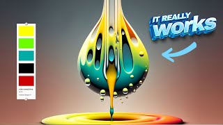
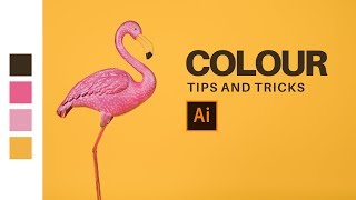
This playlist of videos by Satori Graphics aims to make sure that people can use colour in efficient ways, and also have fun with it too.
If you’re wondering about the use of colour on a logo design or brand, or even something like a cool colour palette for your new poster project, these videos have got you covered.